Bringing taxes to life
Web • IOS • Wireframes • Flowcharts • User Interface • Animation • Prototyping
Introduction
Quickbooks is the world’s largest small business playground
Quickbooks is well-known for its ability to assist small businesses in managing their daily tasks. My primary goal in designing was to enhance the Sales Tax experience and increase trust in the process.
Problem Statement
How can I create a tax system that smoothly transitions 380,000 users from various sources to a single unified system, while taking into account 50 different tax systems and designing the platform they will use?
Early incites
Small business owners struggle with sales tax, spending significant time cross-referencing federal and tax websites. They devote too much energy ensuring they are charging customers correctly. My task was to create a system that maximizes the productivity of their time.
Business goals
Originally made for accountants but needed for small business owners
We aimed to create an all-in-one platform for small businesses, incorporating tools to manage their sales, generate reports, and access and scan all their data related to daily invoicing and sales tax.
Who are we solving for?
Our solution targets small business owners who want to simplify their Quickbooks sales tax experience and proactively manage their business efforts.
Early user research
I interviewed 12 small business owners who had been using Quickbooks sales tax features for at least six months.
Here are the findings
User flow
Before designing, I established the user flow. For new users, the flow includes signing in, reviewing services, and addressing potential issues. Note that this is just one of several possible user flow options. Let me know if you would like additional iterations.
Low-fidelity Onboarding Sitemap
I worked with the Product Manager to determine content hierarchy and data placement. Our explorations often featured conversational design approaches, as they simplified the process as much as possible.
Visual Design
The Intuit Design system is already well-established. Our primary objective was to incorporate universal designs into the primary library.
Wireframes
After creating the user flows, I started sketching, whiteboarding, and developing wireframes.
Great! We now have a basic structure and are prepared for user testing.
User Testing
To begin validating the designs, I tested a straightforward flow.
We discovered the need for
More conversational design to guide users through actions on the page
Improved access to help content
Enhanced editing control for users
Further testing and refinement
We conducted three rounds of testing with current QuickBooks users using high-fidelity prototypes via Zoom. Each round involved six to eight 60-minute sessions utilizing an Invision prototype.
Info page
Iteration 1
Iteration 2
The initial two iterations did not resonate with users and failed to convey the intended message from a branding perspective. We made significant changes, such as breaking down the process into two steps and removing the additional "Tips & Resources" from the bottom of the page.
Iteration 3
The final landing page aimed to provide a consistent and branded experience. To achieve this, I modified the iconography to convey a more technical approach.
Tax page
Iteration 1
Iteration 2
The initial Tax rate page lacked adequate context for users, so I modified the user interface (UI) and conducted further testing.
Iteration 3
The third iteration featured:
A more conversational title
A card above the primary table provides users with more context and assistance
A clearly labeled "batch agency dropdown" using a familiar pattern used elsewhere on the site
Review page
Iteration 1
Iteration 2
The initial iteration of the Review page did not perform well. However, the subsequent version with clear, concise row information fared better in user testing.
Iteration 3
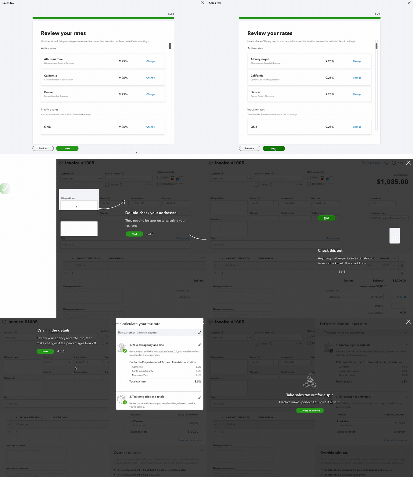
Users frequently requested to view all their data, so we ensured that data transfer transparency was a top priority. We included inactive rates and a secondary message to explain how users could access this information.
Final product:
Desk, iOS, and Android responsive design based on branding and user testing.
Life, Death, & Sales Taxes
When Intuit decided to create this new sale tax feature, we promised to make it easy. Over time I learned that the more conversational the content was, the more relatable it became to the users.
Flexibility & Credibility
Sometimes your tax situation is a little more complicated and requires a more control over. Intuit gives you this flexibility to update and adjust as many times are you need to.
Finished, but not done
The sales tax system I designed for Intuit had a preview feature that allowed users to review their actions before continuing. We included a simple walkthrough to give users a preview of where they would be landing.
Mobile
iOS
I created a simple setup flow for the sales tax feature on mobile since it did not already exist.
Landing page
Address validation
Tax collection page
Agency page search
Add agency selection
Done page!!!!
How we measured success.
We had a successful outcome with this project, which we measured through various metrics. We were able to accommodate a significant number of users, about 380,000, with only a minimal increase in customer care calls, and those were only around 120 requests per week related to the new sales tax feature. Additionally, only 3% of users encountered issues with the flow, which indicates a successful design.
Furthermore, our analytics showed that users had the most problems with the tax mapping screen, and during user testing, 38% of users clicked on the help links above. These insights helped us improve the design, and ultimately, we were able to create a product that met the needs of our users.
If you would like to learn more about the project and see additional displays and interactions, please let me know. I'm always happy to chat about design.
Great job, you made it to the end! During my tenure at Intuit, I also had the opportunity to collaborate with the design systems team on a project related to my passion for accessibility design. Here are some of the illustrations we developed together.
Credits
Analese Steverson Pugh
Firefighter/Product Manager
Murugavel Prabakaran
Super Human Software Engineer
A special thanks to the entire Intuit Design Systems team for making design more accessible for all.


